So I’m in a Facebook group for indie authors. I posted the cover I’ve been working on to get feedback. I was actually on version 10 but posted version 9 by mistake. It had a couple issues but I left it, because after 18 years of design, I know you have to give groups obvious things to pick on. It gives you an opportunity to sidestep groupthink. When presenting any design, if there are obvious things to pick on, people can all pile on and complain about those things. Then you get the real feedback. It’s called a scapegoat element. Designers do this a lot.
So I left the issues. One was a number out of alignment that occured because of a bug in the font. Another was a lute I had removed in the final. No problem.
Now for context, I’ve owned a design, marketing and development company since 2001. I’ve designed software, posters, billboards, business cards, ads, childrens books, packaging, textbooks, nonfiction books… you name it. A lot of logos. I’m very good with UI/UX and do a lot of interactive media design.
I didn’t explain this to the group. The other thing I didn’t explain is I’m a card carrying fantasy geek.
I’ve been reading fantasy for 35 years and I not only know what is selling, I actually have chatted with some of the authors. Michael J Sullivan gave me help with my first five pages. Dyrk Ashton is a Facebook friend. I think Alec Hutson thinks I’m a kook. lol. But he let me read his ARC before he released Red Queen. I met Robert Jordan three times in person and once got in an extended argument with him on the nature of infinity.
When someone tells me to do genre research, well I do. But my idea of best selling fantasy is Josiah Bancroft and Mark Lawrence. Pat Rothfuss, Anthony Ryan. Indies like Michael J Sullivan. Kel Kade. I’ve started reading Jeff Wheeler, love him. My heroes are David Eddings, CS Lewis etc. I’m not into vampires. Urban fantasy is not my jam. But I did read City of Bones. I love LE Modesitt and can even spell his name correctly now.
A book designer is a specialist. No question. I’m not a specialist but I’m by no means a novice. I won awards in school for cover design as well, though it’s been 20 years.
Ok so the image I uploaded is here.
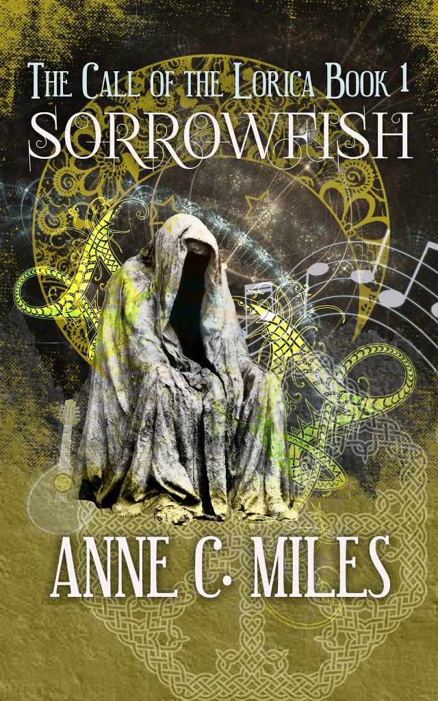
Smaller size is here.

Before I go further I want to say a few things. The typography in this version needs work. While the title might ideally take up 1/2 or 1/3 of the cover, I can’t do that. My title is long and skinny. Unless I rotate it, it is what it is. I can use a tall narrow font. I may indeed yet change it. I tried to compensate by stacking my series title. This version needs to be tweaked in terms of spacing and possible swapping the main title font. Maybe. I can still read it at its smallest size. Anyhow. You get the idea. My planned changes from this version were tweaky. Remove the screened in lute sketch. Work on typography. Move my name down!
And… I was lectured. A lot. They couldn’t identify the genre. And honestly I was told “I would actively avoid a book with a cover like this” and “I hate it.” I think my favorite response was something along the lines of “It looks so bad people might think it’s low quality, not edited…and that might be a selling strategy, lower expectations.” That review actually had several spelling errors. I did laugh. I was told more than once to “hire a professional.” One kind soul took my figure, which is ostensibly in my eyes a spirit (transparent on purpose) and fixed the overlapping images because those shouldn’t be there. LOL.
The Dr Who fans, the fantasy readers, loved it. I got PM’s from folk who told me these people have no idea what they’re talking about. I’ve been to art school, been to jury, and have dealt with groups for a very long time. It’s ok. I was just surprised by the amount of feedback but also encouraged, even by the negative. I appreciated it all. I do.
So this is apparently the type cover design of best sellers that I’m supposed to emulate according to the cognescenti of this group.These are currently selling well. I’m not arguing that. They are mostly urban fantasy and not my genre. At all.
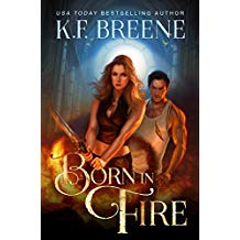
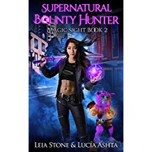

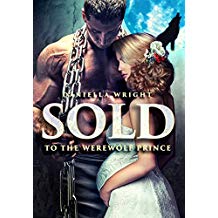
Ok. So my response as an epic fantasy buff to these covers is to run screaming away from the style. To me these scream romance novel. But the truth is their stories and mine would have very little in common. I’d be making a promise to the reader, then breaking that promise. And these stories might be good. But this aesthetic is not right for my story. At all. Several characters in my story are gnomes. Pointy hats and all. My work has much more in common with Terry Pratchett and Madeleine L’Engle than with Breene.
My design philosophy has always been “Be who you are as loud as you can.”
I wanted a painterly-style very detailed cover. I don’t have time to matte paint and I’m doing this cover myself because it’s my baby. It’s important to me. I might yet do a flat style with emphasis on the typography. I like the style and it is trending. I’ve done 3 different designs, this is just the latest. But it’s my favorite so far.
Arguably one of the best-selling fantasy books out right now is Senlin Ascends. Look at his cover!

Just from the first few bestsellers pages on Amazon. For the record, I’m not a Pullman fan but his cover is cool.
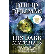

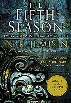
The covers I grew up with had detailed art, paintings. Darryl K Sweet. I’m attracted to that style but it’s retro. This is me trying to create a dimensional, detailed piece that pictures a scene from my story. Yes, it’s got some abstraction. But my genre research meant I looked at actual books I think are quality and sell well. It doesn’t mean joining in on the “indie author” aesthetic.
Yes theres an indie author look. For a fantastic write-up on cover design, plus more resources to research, check out this article.
Anyhow, there are other authors choosing covers and they’re not me, not designers, not hard-headed insane aficionados of their genre. And they’re going to be steered in a direction by others who mean well. They do. I know that. But the direction might be the wrong one for them. So I thought I’d share this experience. Be really careful who you ask for advice, and trust your gut. Convey the truth of your work as loud as you can. Peace.
Post script. After I sincerely thanked everyone for their feedback, I closed out the thread. There were 158 messages, but I had gotten the feedback I needed.
And one of the vocal posters decided to start a new thread with a complaint pointed at me, how if you ask for input you should be thankful to receive it and not argue.
I left the group. I won’t be back. smh.
UPDATE: And I had time to refine my concept.
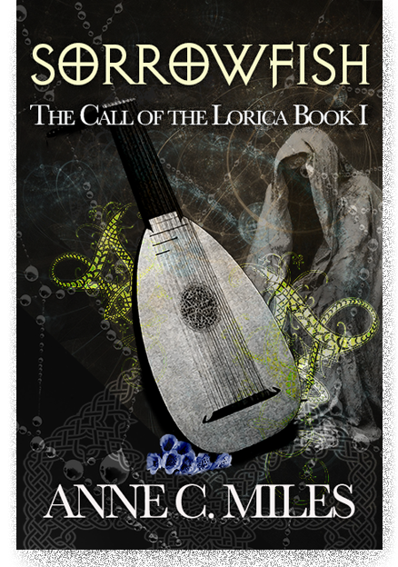
I saw your post in that group. The cover is objectively terrible. What you wanted was praise, not honest feedback.
I read your comments on her cover and there wasn’t any honest feedback, just a bunch of bitter harpies with an “our way or the highway” group think mentality. I’ve seen a bunch of the covers coming out of that group and most of them are complete garbage.
When I saw the image just now in this blog post, I instantly thought it was a beautiful cover. Sure, you can fix the things you mentioned – but it’s a gorgeous piece. I grew up with the art you reference, and it’s the art I still prefer, especially in the fantasy genre. I’d agree that the images the critics thought you should go for definitely make me think of urban fantasy romance. And I actually read quite a bit of romance (though not urban fantasy).
Don’t care what the others are saying, your cover definitely seems more right for the type of book you have. And I happily buy books with such covers 😀 (I guess I’m getting old?)
thanks Emily. Yeah I’m not worried about it. Just very surprised by the response. I likely will do a different cover (but in the same sort of aesthetic!) just because I don’t want the lynch mob to attack the book and am honestly afraid they might if they see it. It was that bad. LOL. But I appreciate your encouragement. Thank you.